Activity Box 内包含一个手作活动的工具和材料、一本说明书和一本游玩指南。透过对品牌的全面改造,我们为Activity Box品牌注入了新的活力,确保它能够有效的吸引品牌的目标受众—家长和儿童。
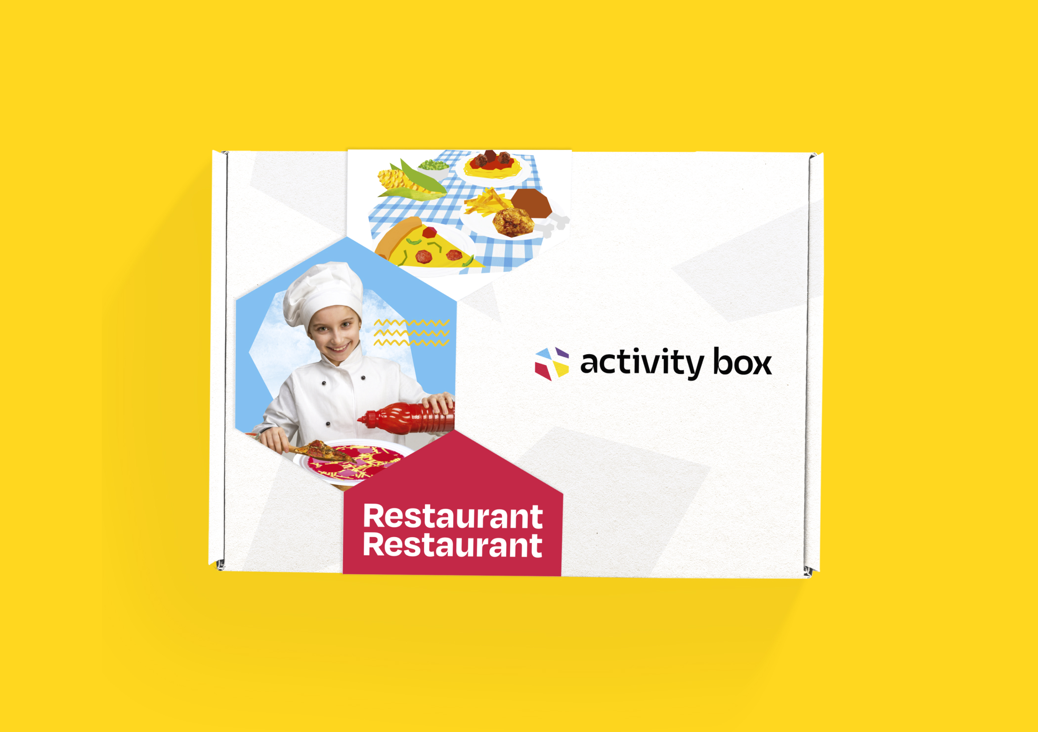
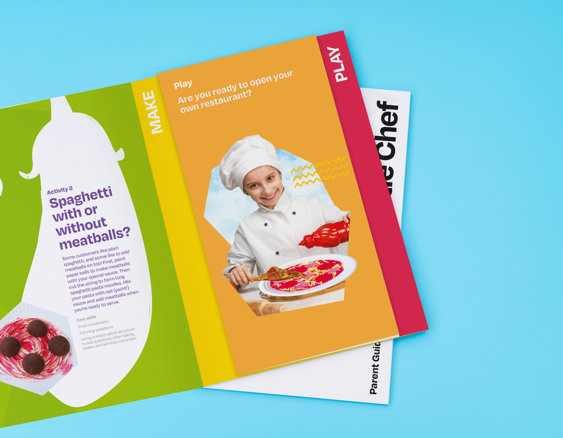
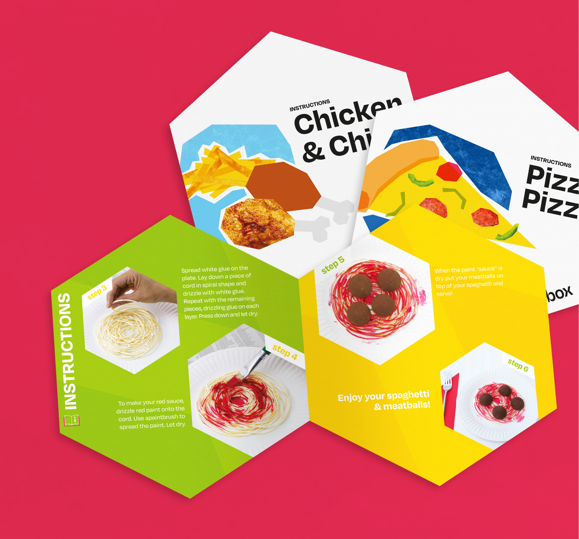
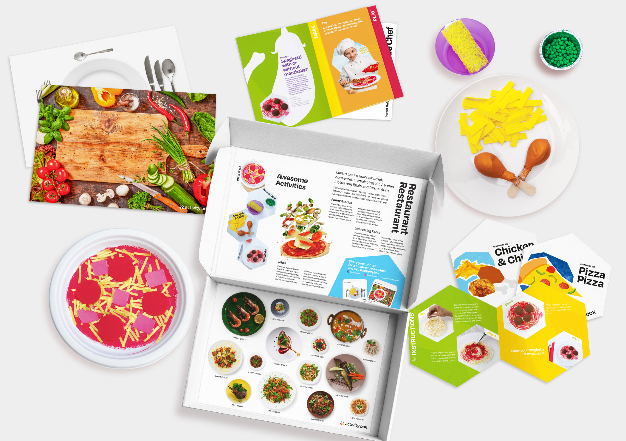
品牌的图像风格融合了有趣的几何形状、大胆鲜艳的颜色和独特的插图,表达创造力和探索的精神。这种视觉语言运用在品牌的主要元素上,包括商标、网页和包装等。


该网站的用户体验直观而且引人入胜,用鲜艳的色彩、互动元素和多媒体内容吸引访客。网站为家长提供了一个平台,了解该计划的服务内容并直接购买。网站上亦展示了顾客的购买体验和照片,展示了儿童参与计划的感受和得着。